
Koctas is the largest home improvement and garden center retailer in Turkey. We redesigned the website after observed customers' physical and digital store experiences.
My Role
The project goal was to build a new Koctas website with an increase in online sales and creating a better experience for customers. I was responsible to accumulate all research findings and evaluate design ideas. This process involves negotiating deliverables with the product team. As the UX team leader in this project, I also execute the UX strategy and designed interactions of the website
Koctas / Project Owner
Userspots / Design Agency
14 Weeks / Duration

Research
The research team conducted 6 research techniques to understand physical store and online experiences by getting behavioral data.

Physical Store Observation
Interview with sales representatives and also customers at peak hours in the role of intern representatives in Istanbul stores
Call Center Visits
Interview with call center agents, social media, live support teams focused on incoming calls, feedback and complaints to define frequent cases and listening hours of call records
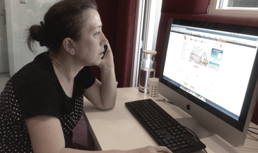
Usability Test
One hour usability test is conducted with 12 users. They are selected through 24-56 years old (student/working/retired) groups. We spent 14 hours for website evaluation
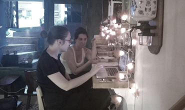
Contextual Interviews
Interviewed with 12 users focused on their shopping experiences on Koçtas, koctas.com.tr and other home development retailers
Netnography & Benchmarking
Accumulated user comments and patterns from social media, App Store, Google Play, etc. Benchmark study with similar websites
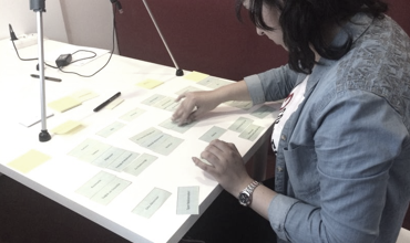
Card Sorting
25 selected products are given to 50 participants to establish the first level category tree

UX Strategy
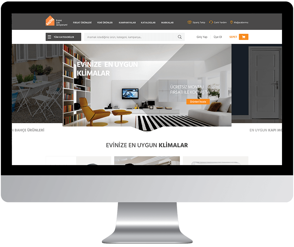
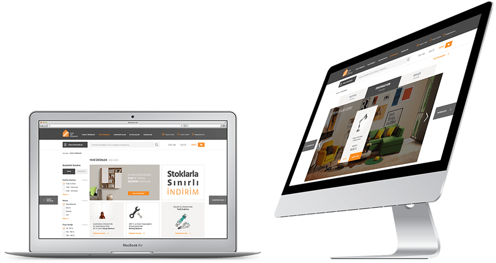
After we analyzed customer habits, living spaces, purchase, and services, we found that local users' expectations were different from global because they prefer "do it for me" instead of "do it yourself". Another research outcome was that customers' needs vary seasonally so we prioritized redesigning of home, category and product detail pages. 80+ screens and 6 flows were designed to cover all experience.
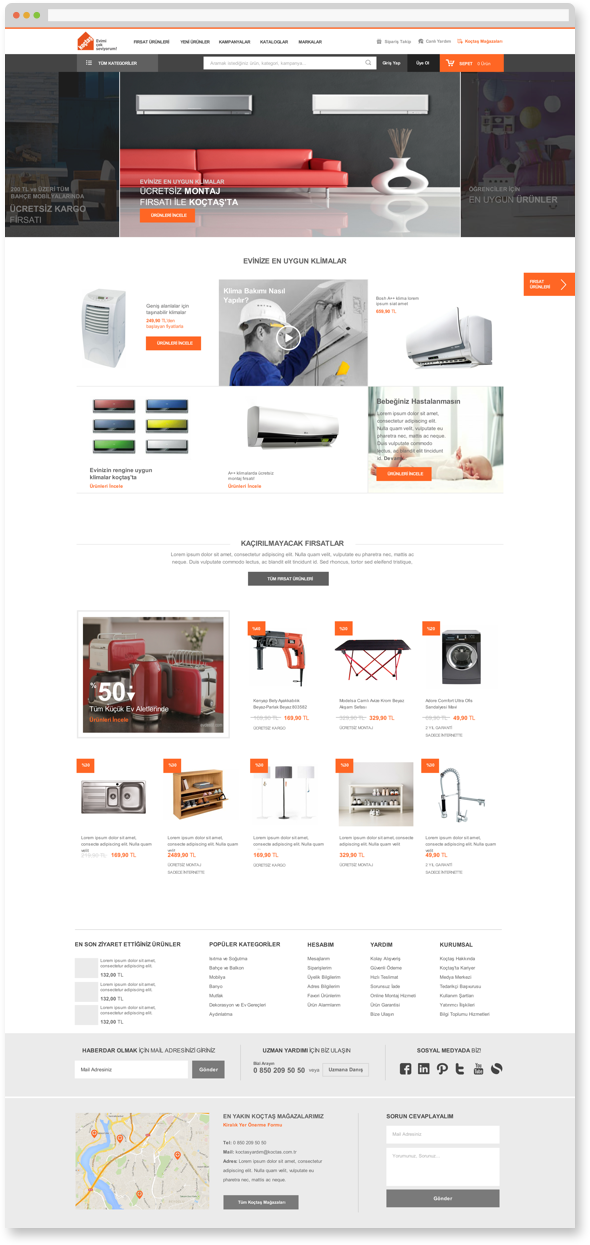
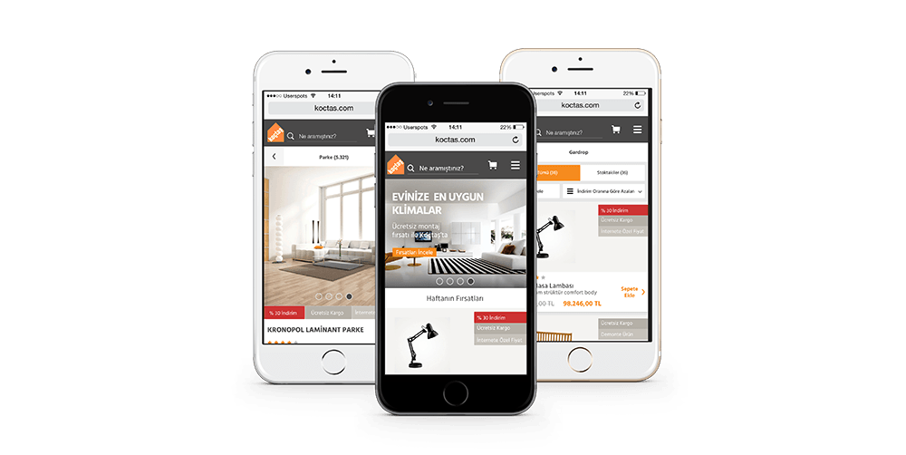
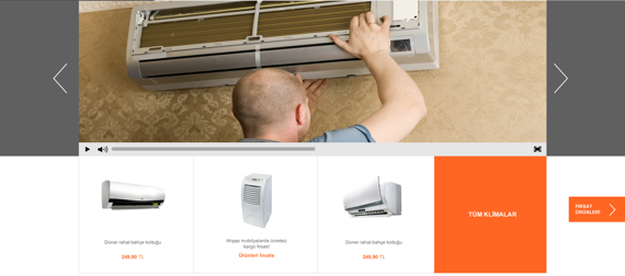
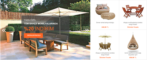
In order to cover seasonal users' needs and interest, we designed carousel to provide related content on the page. Content on the page changed together with the carousel image and search area made more visible to cover expectations.
Before we complete the carousel design, multiple interface design options were tested with users. We also added discount offers to cover the product discovery need.
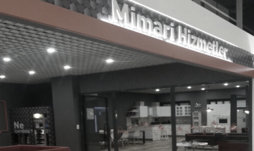
Since customers perceive many house development products as a part of the whole living area needs, it is challenging for them to fulfill their needs in a physical store. For that reason, some living spaces were organized in the stores enabling them to have a holistic view. These spaces don't only support product sales, but also simplify the purchase journey of customers with related products for different spaces.
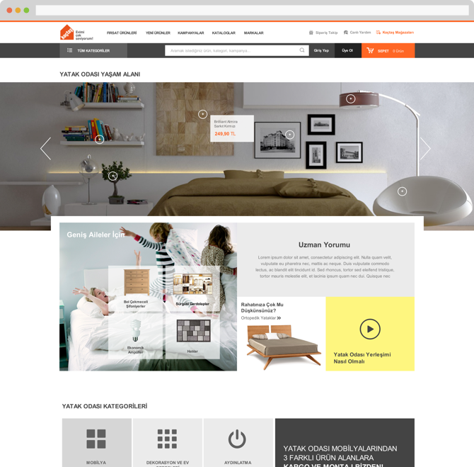
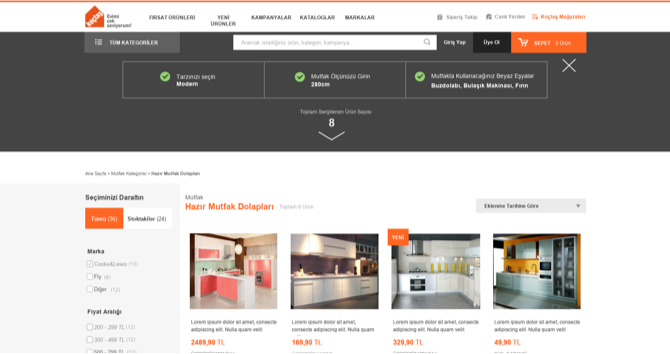
Customers' different needs and expectations for each category led us to adapt the design. For example, while the kitchen category highlights product inspiration and technical information, garden/outdoor and balcony categories focus on seasonal contents.
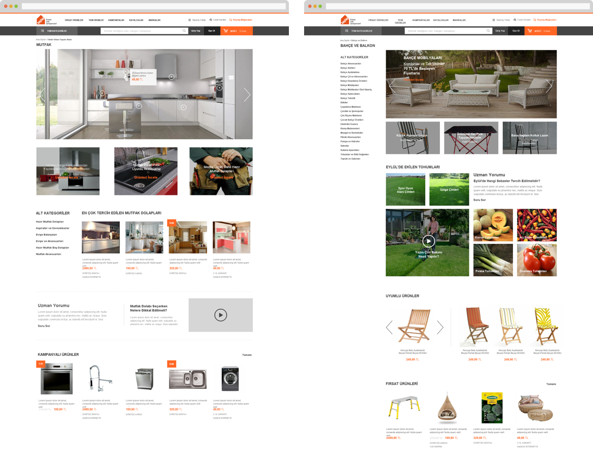
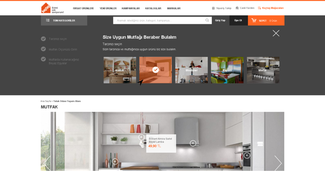
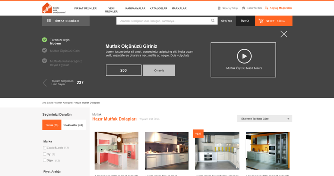
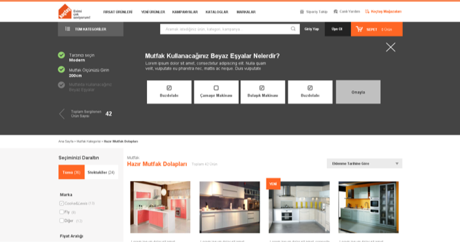
The product finder is built as a guide for the moments that users have difficulty in product choice and staying on the page without taking an action. By this way, we support the user's decision-making process.
In product detail pages, research outcomes state that users need quick answers related to products. For that reason, 3 modules are highlighted "Features, Comments and Specialist Comments". In addition, enlarged images and extra product information guide users for the purchase decision.
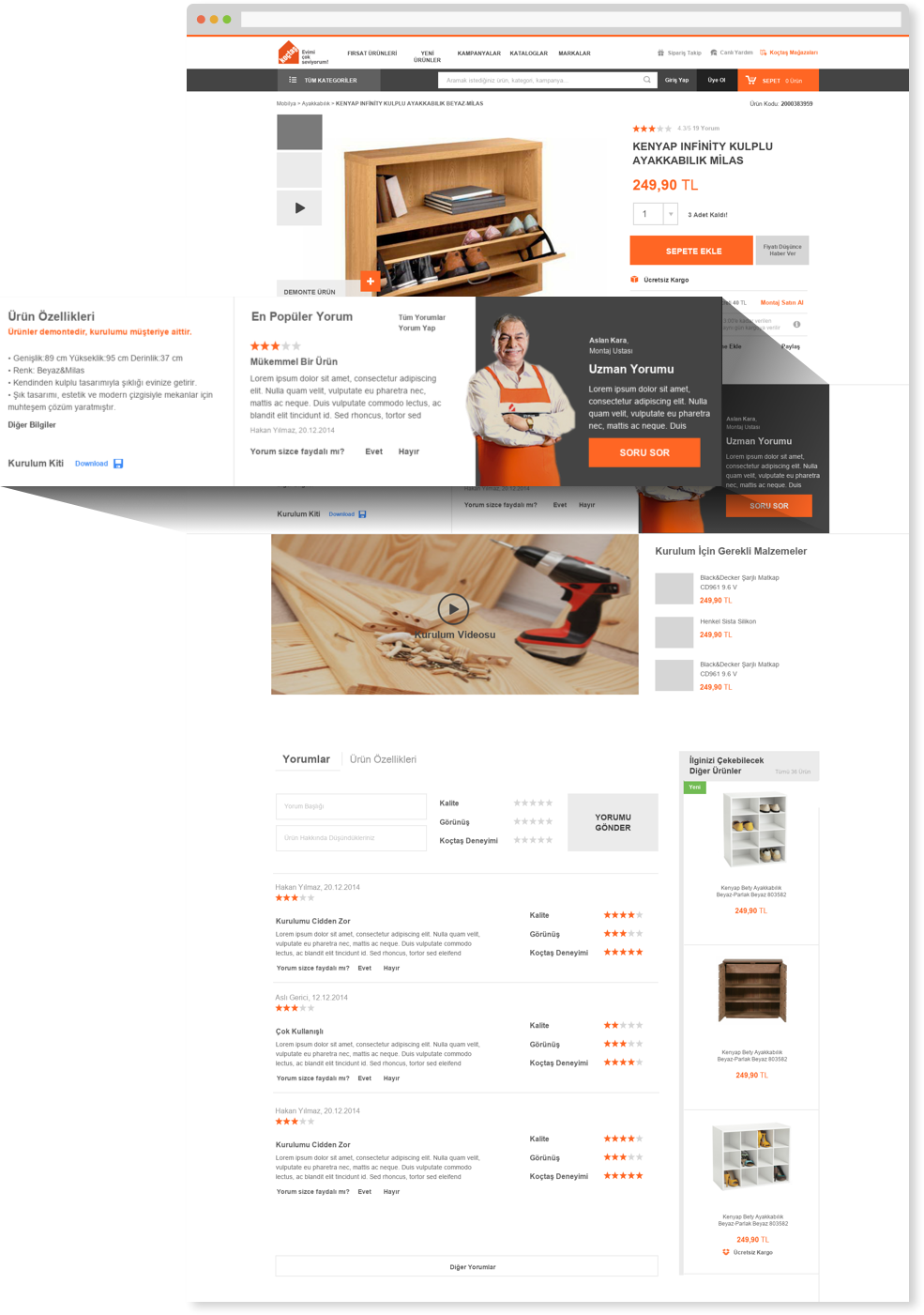
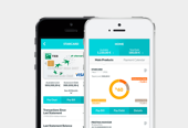
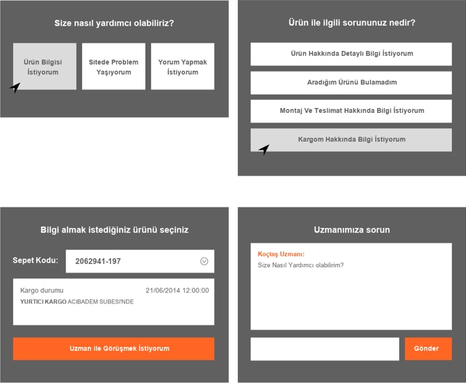
Call center conversations exposed that calls are mainly about customer problems that can be solved by providing accurate information. In order to solve that need, "get a help" module is created. The result was not an only a comprehensive support tool to customers but also a decrease in call center workload.
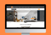
VISUAL DESIGN
m.koctas.com.tr
Responsive design is not possible because of the need for different structure in mobile use in research conclusions. You can check out the mobile website.